User Guide of Magento 2 Photo Gallery Extension
At the backend, go to FME EXTENSIONS > Configurations. Here you can find the extension configurations.
General Configurations
• Enable Module: Option to Enable/Disable photo gallery module

Image Settings on Upload
- Thumb Width: Set the gallery image thumbnail width
- Thumb Height: Set the gallery image thumbnail height
- Keep Frame of Thumb: Enable/Disable the frame of thumbnail in the gallery
- Keep Aspect Ratio of Thumb: Enable/Disable the aspect ratio of thumbnail in the gallery
- Thumb Background Color If Keep Aspect Ratio (Yes): Set the background color of the gallery image thumbnail. Default is set as White (#ffffff)
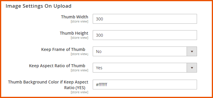
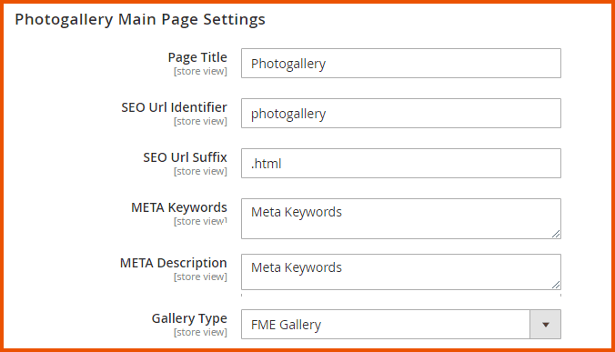
Photo Gallery Main Page Settings
- Page Title: Enter the title of the photo gallery page
- SEO URL Identifier Enter the title for SEO URL Identifier
- SEO URL Suffix Enter the SEO URL Suffix for photo gallery main page e.g. .html
- Meta Keywords: Enter meta keywords for the photo gallery main page
- Meta Description: Enter the meta description for the photo gallery main page
- Gallery Type: Choose the type/theme of the gallery from the following:
- FME Gallery
- 3D Gallery
- Mensory
- Nano Gallery
- Media Player Gallery
Note: User can place the gallery on:
- Main Landing Page
- Category Page
- Product Page
- Anywhere Through CMS Content
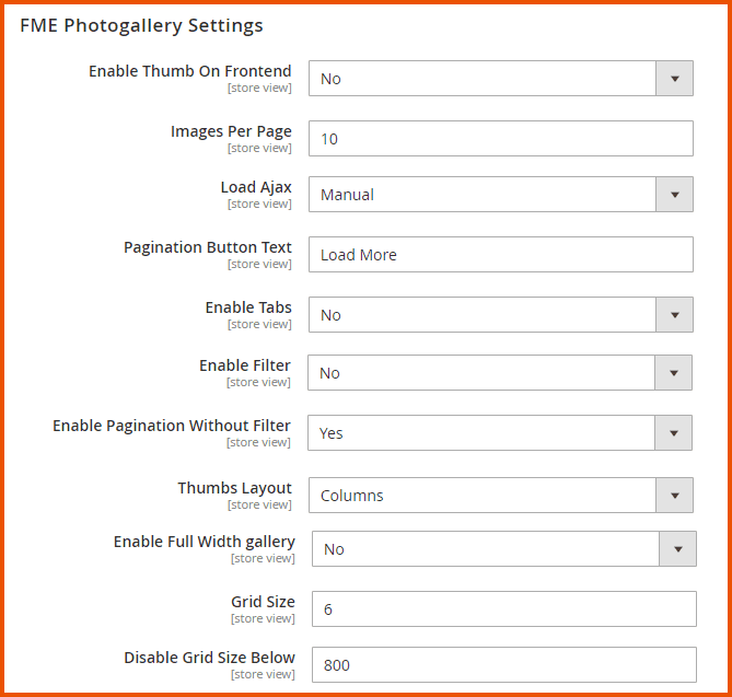
FME Photo Gallery Settings
- Enable Thumb on Frontend: Option to Enable/Disable the thumbs images on frontend
- Images Per Page: Enter the minimum number of images per FME photo gallery page (Note: Minimum Limit is 10)
- Load Ajax: Option to Load Ajax
- Manual
- Auto
(Note: If you load the Ajax manually, then the pagination button text field will appear)
- Pagination Button Text: Enter text for pagination button e.g. Load More
- Enable Tabs: Option to Enable/Disable the tabs
- Enable Filter: Option to Enable/Disable the filter if there are no tabs on the photo gallery page
- Enable Pagination Without Filter: If you disable the filter then you can Enable/Disable the pagination
- Thumbs Layout: Choose the layout of thumbs (to arrange the images of photo gallery)
-
- Final
-
- Columns
- Enable Full-Width Gallery: Option to Enable/Disable Full-Width gallery. By Enabling It, Gallery is 100% responsive. So, it can be used on a full-screen page.
- Grid Size: Images can be vertically cropped to enhance the chance of being aligned on the bottom borders, which usually prevents the gallery from arranging in columns. So, a higher value could improve the overall layout, but it will crop images. Grid Size should be in the form of numbers i.e. 10,20,30,40,50 etc.
- Disable Grid Size Below: If you have small images at low screen resolutions, then you could want to disable image cropping to avoid even smaller images. Use the Disable Grid Size Below to avoid automatically. Set the Grid Size to 0 and avoid image cropping when the screen is under the resolution pointed by this parameter.
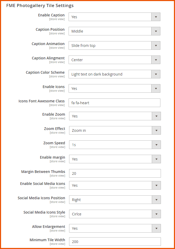
FME Photo Gallery Tile Settings
- Enable Caption: Option to Enable/Disable the caption
- Caption Position: Choose the caption position as
- Top
- Middle
- Bottom Caption Animation: Choose the caption animation from the following options:
- None
- Fixed, Always Visible
- Fixed with Background
- Fixed with Background, Hide on Mouse Hover
- Fixed at Bottom with Gradient Background
- Slide from Top
- Slide from Bottom
- Caption Alignment: Choose the alignment of caption
- Left
- Center
- Right
- Caption Color Scheme: Choose the caption color scheme
- Dark Text on White Background
- Light Text on Dark Background
- Enable Icons: Option to Enable/Disable adding of icons along with the caption
- Icons Font Awesome Class: You just have to select the class of the icon from the font awesome website i.e. https://fontawesome.com/icons
Enable Zoom: Option to Enable/Disable the zoom on each tile of the photo gallery page
Zoom Effect: Choose any of the zoom effects
- Deep Zoom In
- Zoom In
- Zoom Out
- Deep Zoom Out Zoom Speed: Choose the zoom speed on tile
- 1s
- 0.5s
- 0.35s
- 0.2s Enable Margin: Option to Enable/Disable the margin between the tile Margin Between Thumbs: You can add the margin between the tiles. Margin is in pixel Enable Social Media Icons: Option to Enable/Disable social media icons Enable Social Media Icons: Option to Enable/Disable social media icons Social Media Icons Position: Choose the position of social media icons
- Right
- Bottom Social Media Icons Style: Choose the style of social media icons
- None
- Circle
- Bar
- Allow Enlargement: If you enable it, it may affect the pixels of the image.
- Minimum Tile Width: Enter the width of the tile. The width should be multiple of 200.
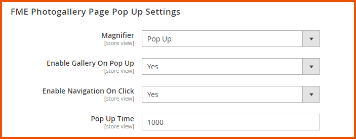
FME PHOTO GALLERY PAGE POP UP SETTINGS
- Magnifier: Choose the magnifier
- Pop Up
- Light Box
- Enable Gallery on Popup: Option to Enable/Disable the gallery on the popup
- Enable Navigation on Click: Option to Enable/Disable the navigation on click. This field will appear if you enable the gallery on the popup.
- Popup Time: Enter the popup time i.e. Fade In and Fade Out time of popup. Time is in milliseconds
PRODUCT GALLERY SETTINGS (CAROUSEL ONLY)
- Enable Product-Related Photo Gallery: Option to Enable/Disable product-related photo gallery

CATEGORY GALLERY SETTINGS (CAROUSEL ONLY)
- Enable Category Related Photo Gallery: Option to Enable/Disable category related photo gallery
- Position: Choose the position of the category related photo gallery
- Top
- Bottom

Carousal Settings
- Navigation Button: Option to Enable/Disable the carousel on Products Page, Category Page, and CMS block
- Auto Play: Option to Enable/Disable autoplay in the carousel
- Rotation Time: Add the autoplay time or rotation time. Time is in milliseconds
- Number of Items in Carousel: Enter the total number of items in the carousel limited from 5 to 20

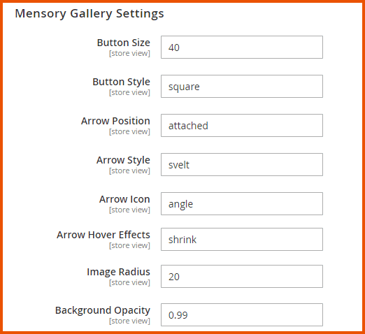
Mensory Gallery Settings
- Button Size: Enter the size of the button in pixels
- Button Style: Enter the style of the button i.e. default, square, circle, rounded
- Arrow Position: Enter the position of the arrow i.e. inside, outside, attached
- Arrow Style: Enter the style of the arrow i.e. default, square, circle, rounded, svelt
- Arrow Icon: Enter the icon of the arrow i.e. default, caret, angle, chevron
- Arrow Hover Effects: Enter the hover effects of the arrow i.e. zoom, shrink, translate
- Image Radius: Enter the radius of the image
- Background Opacity: Enter the value for background opacity (Note: Use the value from 0 to 1 like 0.7)
Nano Gallery Settings
-** Gallery Type:** Choose the type of gallery
- Gallery
- Thumbs
- Layouts: Choose any of the layouts:
- Water Fall Layout
- Simple Justified Layout
- Broken Mirror Layout
- Instagram Layout
- Full Content
- Content with More Button
- Pagination by Numbers
- Pagination by Dots
- Gallery on 2 Rows
- Custom Layout
