Make Your Magento Store Mobile Friendly in 5 Steps

As the title indicates, this article will discuss everything there is to know about making your Magento 2 store mobile friendly. To keep things short and to the point, we will help you optimise your store for mobile devices in just 5 simple steps. Before listing these 5 steps, let us understand the importance of mobile optimisation.
Why Focus on Magento Mobile Optimisation?
First of all, mobile optimisation is not a choice but a necessity. Here’s why:
1. User Experience
A well-optimised store translates to faster loading times, easier navigation for the users, and a quicker checkout process.
2. Mobile Device Traffic
We suggest you look at the source of your store’s traffic. In 99.99 per cent of the cases, most of the traffic comes from mobile devices. The below statistic confirms this point too.
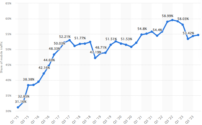
As you can see, more than 50 per cent of the global traffic comes from mobile devices. If your Magento 2 store is not optimised for such devices, you are losing more than 50 per cent potential customers.
3. Search Engine Rankings
Google and almost every other search engine prioritises websites which are mobile-friendly. In simpler words, if your website is optimised for mobile devices, it will appear higher in the search engine results pages.
4. Increases Engagement
By optimising the store for mobile devices, store owners can benefit from enhanced engagement. The reason is that mobile devices can be used to send push notifications. This can help in retaining customers and fostering greater loyalty.
5. Higher Conversion
Since the majority of the traffic comes from mobile devices, an optimised store can increase conversions. A user does not need to open the laptop to complete the purchase. Instead, they can simply order the product from their smartphone.
Monitoring Mobile Device Performance
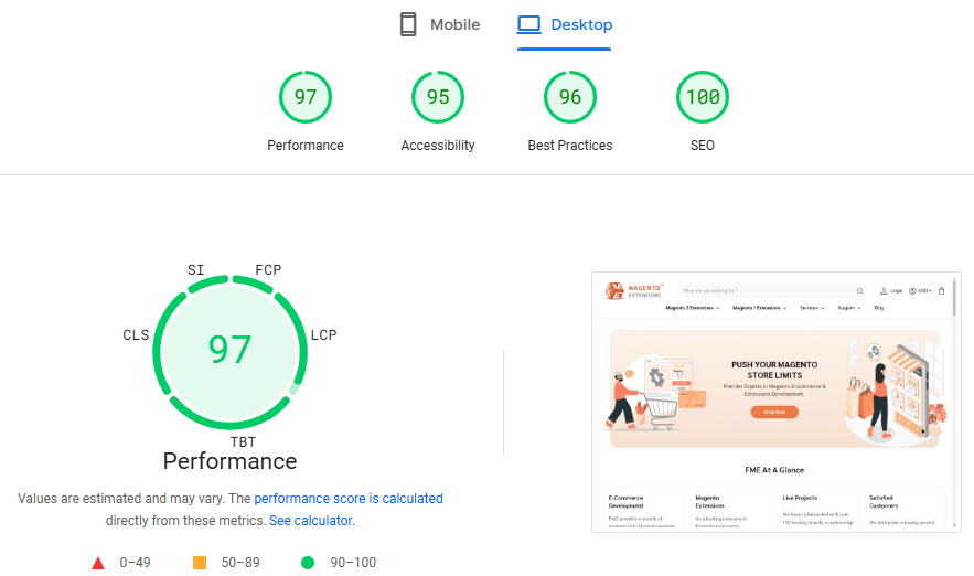
Prior to implementing the tips, we recommend assessing the store’s mobile device performance. You can do this by going to Google’s PageSpeed Insights . All you need to do is enter the URL and the tool will do the rest. In a few seconds, you’ll be able to access a report showcasing the site’s performance across mobile and desktop devices as you can see below.
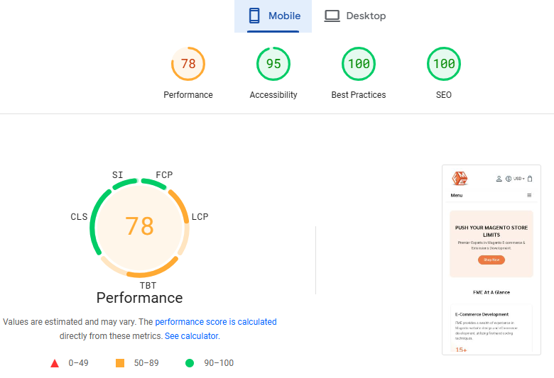
Based on the above report, there’s room for improvement in FME’s website when it comes to mobile devices. Nevertheless, it is not always desirable nor practical to go for further improvements. But this is something which you must decide based on your requirements and other aspects. In contrast, FME’s performance across desktop devices is near perfect.
After implementing the tips, re-run the test to see if there’s any improvement. Now, let’s shift our focus towards the steps.
Magento for Mobile – Top Steps for Mobile Optimisation
1. Choose a Responsive Theme
Most merchants opt for Magento because of its customisation. Magento is one of the few eCommerce platforms which allows store owners to customise every aspect of their store. Unfortunately, when developing a custom theme, store owners overlook the most important aspect – responsiveness. Whether you are using a custom theme or a pre-built template, ensure it is responsive by testing it on different devices.
Choosing a Mobile-Friendly Theme
The best place to look for a mobile-friendly theme is the Magento marketplace. You can find numerous themes for a variety of niches. Of course, you will need to spend a little bit of money if you are looking to get a theme which helps your store stay ahead of the competition.
When it comes to responsiveness, look for features such as mobile-optimised checkout process and touch-friendly navigation. The alternative is to hire a Magento theme development company to design a custom mobile-friendly theme. Do keep in mind that the costs of engaging such a company is quite high.
2. Website Optimisation
Compared to the desktop users, mobile devices users often have limited data. Naturally, they’ll hesitate opening websites which consume too much bandwidth. Therefore, mobile optimisation involves tweaking the website in a way that it loads faster and consumes less data. This can be achieved by:
Optimise Images
An eCommerce website is full of images and other multimedia. Therefore, the first focus should be on optimising the images. Ensure that the images are in the next-gen format – WebP. This format is 30% less in size compared to JPEG and other formats. Despite the significant reduction in size, there’s no impact on the image quality. You can use the WebP Images Extension by FME .
Minimize HTTP Requests
The next step is to combine CSS and JavaScript files. This will go a long way in improving your site’s loading speed. At the same time, it reduces the required bandwidth to load the website properly.
Enable Cache
Magento 2 has a variety of cache which you need to enable and configure for optimal performance. Whenever a user revisits the website, there is no need to send a repeat request to the server, thereby reducing server load. Instead, the elements are retrieved from the cache stored on the user’s device.
For more information on Magento 2 cache types, refer to our article on “Magento 2 Cache Types and Management: A Comprehensive Guide . If your website is serving users across different categories, then we recommend investing in a content delivery network (CDN). Refer to ‘Top 8 Magento 2 CDN ’ for more information.
Lazy Loading
This feature only loads the elements which appear on the screen instead of the entire webpage. This is a great way to reduce bandwidth consumption and boost loading speed. When a user scrolls down, the rest of the elements begin to load.
Readable Content
Moreover, use a font style and size which is easily viewable on mobile devices. Otherwise, users will have trouble reading the product descriptions or reading your blogs. Speaking of blogs, Magento 2 does not have a built-in blog feature. Therefore, if you are considering setting up a blog for your store, check out the SEO Friendly Blog Extension by FME .
3. Focus on Site Navigation
One of the top reasons behind a high bounce rate is poor site navigation. If a user has trouble finding the required information, they have no interest in sticking to your website. They will simply close the tab and move to another website. Therefore, improving the site navigation is important not just for capturing mobile users. Here’s how you can improve the site’s navigation:
Keep the Menu Simple
First of all, minimise the number of items on each menu. Since mobile devices have limited space, there’s a possibility that users may not even see the entire menu or keep pressing another button. Therefore, only have relevant menu buttons. Make sure that they are large enough.
Use a Common Mobile Menu Design
To avoid over burdening users with too much information, the best approach is to use a hamburger or toggle menu.
4. Streamline the Checkout Process
Mobile users don’t have the time or patience to first the product on their smartphone and then turn on their laptop to complete the purchase. Instead, for them, the mobile device should be sufficient enough to go through with the transaction. Therefore, it is imperative that Magento 2 store owners streamline the checkout process for mobile users. Here’s how to do it:
Mobile Payment Options
First and foremost, it is imperative to provide users with the option to use mobile wallets to complete a purchase. This simple addition can boost your store’s conversion rate considerably.
Guest Checkout
The registration form can be quite frustrating to fill on a mobile device. Therefore, consider setting up guest checkout option for the users. Of course, we understand that guest checkout is a concern for store owners. After all, registered users provide valuable information which can be used for marketing purposes and personalisation. With the Magento 2 Convert Guest to Customer Extension by FME , store owners can automatically convert a guest user to a registered user by automatically creating an account for them.
AutoFill Features
By offering autofill features for forms, stores can save the user valuable time. Instead of wasting time on entering the information, they can focus on the product.
5. Miscellaneous
User Privacy
Mobile users are extra vigilant about their security and privacy. After all, mobile devices contain user’s personal information, including images. Therefore, display the privacy and data handling policy prominently across the website. This will reinforce user trust and compel them to complete the purchase.
Social Media Integration
Apps such as Instagram, TikTok, and Facebook are mostly accessed using mobile devices. Therefore, it is important as a store owner to allow users to share content across social media platforms. This can be done by adding social share buttons. Apart from this, allow users to login using social media profiles for enhanced user experience.
Final Thoughts on Magento for Mobile
This concludes our article on how to optimise your Magento 2 store for mobile devices. We would like to reiterate that don’t just take these steps as a box ticking exercise. Instead, after implementing these steps, monitor the website’s performance. If there’s no significant improvement, try to determine the root cause and implement a tailored solution based on your requirements.
Remember, by embracing mobile friendliness, you're not just capturing customers; you're creating an immersive, delightful experience that keeps them coming back for more. If you require help in making your Magento 2 store mobile-friendly, contact us . Our dedicated Magento 2 professionals have considerable experience in optimising stores and helping them stay ahead of the competition.
This blog was created with FME's SEO-friendly blog